That may be the case, however, I have an issue with the diagram in it's current state without racism or otherwise. It is simply wrong.
Figure 8-7 compares apples with oranges. For all these wonderful people that may be living in the USA right now, their income is a snapshot of compared to the entire of the GDP per capita of their homeland countries. There is also the possibility the income of those living in the USA is counted in the GDP of their country.
Even if one makes the statement this is a legitimate comparison, the entire set of facts are wrong. Take as an example the first on the left, Danish.
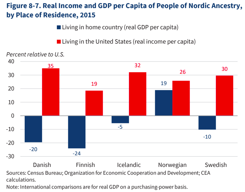 The GDP per capita in 2015 was 358.4 in Danish Krona (DKK) (click here). When accounting for differences in the exchange rate by today's standards of 1:6.6 that means it was $54.30 US. The chart is simply wrong. The USA GDP per capita in 2015 was $51,933.40. The comparison is supposed to be in "Percent relative to US." Now, $54.30 is less than 1 percent of USA GDP, but, it is not in the negative range. GDP per capita can't be in the negative range unless there is an accounting for each person's portion of national debt and if that is the case, the USA would be in the negative range far beyond that of Danish country, Denmark.
Now, while this is prejudicial and racist, it is also very incorrect. This is the Economic report of the President of the USA and it is out of balance with past president's reports.