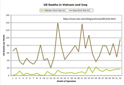
The chart line on the top is of Iraq. It has a higher inital death toll. This is the first 32 months of engagement in both wars.
The second line is of Vietnam beginning in 1961 when President Kennedy first deployed advisers to South Vietnam. Looking at this graph it is obvious when his assassination took place and President Johnson took office escalating the commitment to South Vietnam by deploying numbers of troops. Afer the 23rd month of this chart the numbers in the Vietnam War started to escalate.
Noted: There is an average increase in fatalities at least six times that of Vietnam at any point on this graph.
